[vc_row css=”.vc_custom_1573576953924{margin-top: 32px !important;}”][vc_column width=”1/2″][vc_custom_heading text=”What are Vector Images?” use_theme_fonts=”yes”][vc_column_text]Vector images are made up of positioning text co-ordinates within a file. Much like GPS co-ordinates, they are positioning points within a defined area. Vector images can be scaled up to any size without losing quality due to this coordinate system. They are also very small in file size as they do not have to encompass the pixel data that raster graphics do.
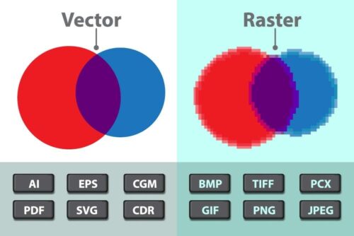
Most of the signage that you see around you will be printed with vector graphic artwork. This is due to the size of the scaled outlines, so they do not blur. Take a look at the header image on the page, you’ll see the different characteristics of each file.
Because the information within vector graphics is co-ordinate based, printing presses can use those co-ordinates to print very sharp text in small sizes. For labels and stickers, this is perfect for bring clarity to your design. So if you have small text on your label or sticker design, make sure it’s vector format.
The whole vector/raster saga can get quite confusing though, mainly due to graphic programs such as Adobe Illustrator or Corel Draw which can combine both raster images and vector images into a single file. When this happens, if artwork is scaled up, the vector elements within the artwork scale perfectly, however the raster image will lose quality.
When we’re requesting vector graphics, we are requesting that all elements within the file are vector when possible. This however is sometimes impossible as you have combined raster elements such as photos and vector elements in your files.
So what do you do? First you need to setup your vector document to the size of the label and sticker. Then you need to ensure that the raster graphic when imported at the correct size is at least 300 ppi. You can then add your vector text and elements to the design stage.
Using this method will bring you the best results.[/vc_column_text][/vc_column][vc_column width=”1/2″][vc_custom_heading text=”What are Raster Images?” use_theme_fonts=”yes”][vc_column_text]Raster image files are made from pixel data. Perfect for photography where scenes are made from thousands of colours. Each pixel that is displayed on the screen within the file is assigned a colour. For non-compressed raster images every single pixel will have a different value which makes the files very large in comparison to vector.
Because the raster image is split up into a grid of pixels on X and Y axis, the smooth curves of small text get turned into grid form too. This means that unlike vector images, the smooth curves of text turn into small blocks of solid colour. The higher the resolution of the file, the smaller the blocks can be, however the file size becomes far larger. This is also the same for shapes.
A good rule of thumb to get the best quality/file size compromise is to make sure your artwork is 350ppi when it’s actual size. If your artwork contains small raster text, either recreate it in a vector format or set the resolution to a minimum of 600ppi. PPI stand for Pixels per inch.
If you import vector graphics into a raster program, bear in mind that the vectors will be converted into pixel data also, therefore lose quality.
Raster graphics cannot be scaled in the same way that vector graphics can. I’ll explain why.
A simple A4 sized raster image at 72ppi has far less pixels than an A4 raster image at 350ppi. For this reason, when you scale up a 72ppi image to 350ppi the application has to input extra data for all those missing pixels. It does this by looking at the 72 ppi pixel data and filling in the gaps around those pixels with a similar colour. Much like when a TV upscales HD 1080 to 4k. It’s not really true 4k, but it has the same amount of data.
Now there is also compression when it comes to raster files, such as jpeg. This is done by reducing the amount of colour data within the file. The application looks at the overall colour data of the images and starts to reduce it into blocks of similar colour. So gradients can start to appear blocky rather than smooth. The higher the compression the more colour combination happens. The best form of raster file is a TIFF, so that no compression has occurred. Bear in-mind that there is not point converting a jpeg to a TIFF as the image data has already been compressed.[/vc_column_text][/vc_column][/vc_row]